Indeed this is the best website ever created
http://www.tenaciousdmovie.com/
It allready starts with the intro:
Quote:
Ok dude grey won't cut it, this website gotta be black. Paint it black. Black is the color of rock, because black is the absence of light.
Besides the fact this site is hilarious, tongue in cheeck it is well build and packed with cool stuff.
One of the best features i have ever seen is the rock the internet feature.
An extreme makeover for any site you suggest but in their own unique way. This is very very well done!
The best part is you don't have to fill in huge forms, leave your email address etc,...
This is how it should be.
Be funny and don't try to sell anything.
Look what they did to this blog:
http://www.tenaciousdmovie.com/rocktheinternet/?id=2485
Hail hail hail!
woensdag, oktober 25, 2006
Movie websites: The past, the present
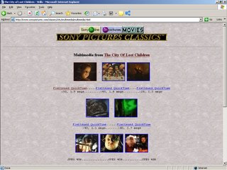
This is how movie websites looked like about 10 years ago:
http://www.sonypictures.com/classics/city/
This is what they look like now:
http://www.eragonmovie.com/main.html?cid=us
If you are somewhere around 30 you will remember the times you were waiting 7 minutes to view a 30 second trailer in a format of 160/120 pixels. And at that time it felt like you were the premier witness of something magical.
Now we allmost have it all. Sound, effects, animation,...
But still the average medium resolution of a trailer is somewhere between 320/160 and 480/260. This means we've added about 200 pixels in 10 years.
Maybe not that much? But then again, it shouldn't really matter.
I was as excited back then, as I am now and will be in the future.
It's like with television. Nobody missed it back in the days it didn't exist.
15 years ago we didn't care for broadband technologie or Flash or Ajax, because it was just not there.
We'll see what the future brings.
Past:
Present:

http://www.sonypictures.com/classics/city/
This is what they look like now:
http://www.eragonmovie.com/main.html?cid=us
If you are somewhere around 30 you will remember the times you were waiting 7 minutes to view a 30 second trailer in a format of 160/120 pixels. And at that time it felt like you were the premier witness of something magical.
Now we allmost have it all. Sound, effects, animation,...
But still the average medium resolution of a trailer is somewhere between 320/160 and 480/260. This means we've added about 200 pixels in 10 years.
Maybe not that much? But then again, it shouldn't really matter.
I was as excited back then, as I am now and will be in the future.
It's like with television. Nobody missed it back in the days it didn't exist.
15 years ago we didn't care for broadband technologie or Flash or Ajax, because it was just not there.
We'll see what the future brings.
Past:

Present:

maandag, oktober 23, 2006
Projects, projects
Yes we are doing projects too people!
This is the latest one in production. Doing stuff with vectors, zooming in and out.
Pretty cool actually.
Drawings done by Bert:
http://www.duasa.be
Check out some screenshots:
Flash:
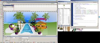
Browser:

This is the latest one in production. Doing stuff with vectors, zooming in and out.
Pretty cool actually.
Drawings done by Bert:
http://www.duasa.be
Check out some screenshots:
Flash:

Browser:

Serge is out there!
Check out Serge Jespers own podcast:
http://kitchencast.podshow.com/
Serge dude, thanks for doing this. I'm a fan.
http://kitchencast.podshow.com/
Serge dude, thanks for doing this. I'm a fan.
vrijdag, oktober 06, 2006
Motion tracking in Flash 8
I have made a screen capture of some of my motion tracking tests in Flash 8.
I also created a recording function as you can see in the movie below.
The left screen is the captured data, the right screen is the original incoming data.
I was using the flashlight on my cell phone as the light source, which was not very reliable.
But it's working.
The data is captured at a rate of 1 millisecond at 800/600 resolution. That is not bad, not bad at all.
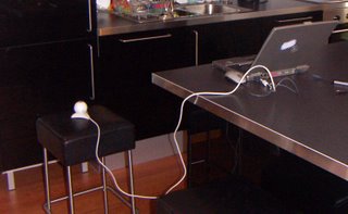
Here's a view of my very professional setup :-)

dinsdag, oktober 03, 2006
Behind the scens of a website part II
The fine folks from http://www.agencynet.com/ have put the making of ownyourownC online.
Some shots:
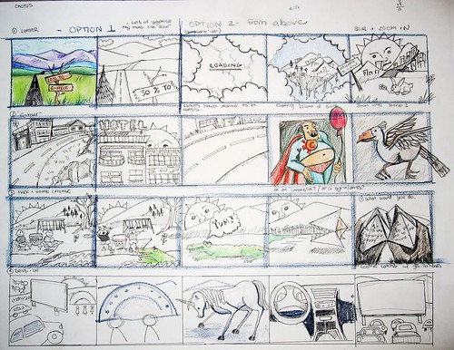

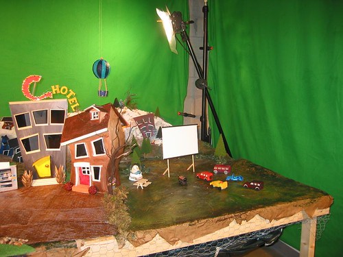
Check out all the pictures here:
http://flickr.com/photos/agencynet/sets/72157594302132588/
It's like I said before, read this article, the days one could do with some Photoshop and some Flash are way behind us now.
Nice work and thanks to agencynet for putting this making of online.
It really is time I start working with the fine people at:
www.beastanimation.be
Some shots:


Check out all the pictures here:
http://flickr.com/photos/agencynet/sets/72157594302132588/
It's like I said before, read this article, the days one could do with some Photoshop and some Flash are way behind us now.
Nice work and thanks to agencynet for putting this making of online.
It really is time I start working with the fine people at:
www.beastanimation.be
maandag, oktober 02, 2006
Abonneren op:
Reacties (Atom)
